


Typography is everywhere. When you see posters, brochures, logos, websites, or anything that has text, to a smaller or larger extent, it involves the use of typography. In today’s competitive business environment, brands have to create their distinctive identities. They must grab target customers’ attention to convey a brand message. For that to happen, graphic designers use typography as a potent tool to turn text into an impactful visual.
This ultimately results in building recognition for a brand. The skillful use of typography gives unique shapes to text in the design and places the letters in such a way that it becomes memorable for viewers.
So, we can say that the strategic use of typography is key to making a brand, especially if it is an aspiring startup, stand out in its niche market. This design element makes logos, websites, etc., marketing tools look distinctive. But the use of typefaces is not just the sole prerogative of the designers. Besides the designers, the artists also make typography art to create amusing figures using letters in varied ways.
However, before you proceed to design your brand’s visual identities with typography, know its different aspects.
Graphic designs are meaningless if they aren’t well-equipped with typography. The use of typography elements has an overwhelming presence, especially in text-based designs.
What Is Typography?
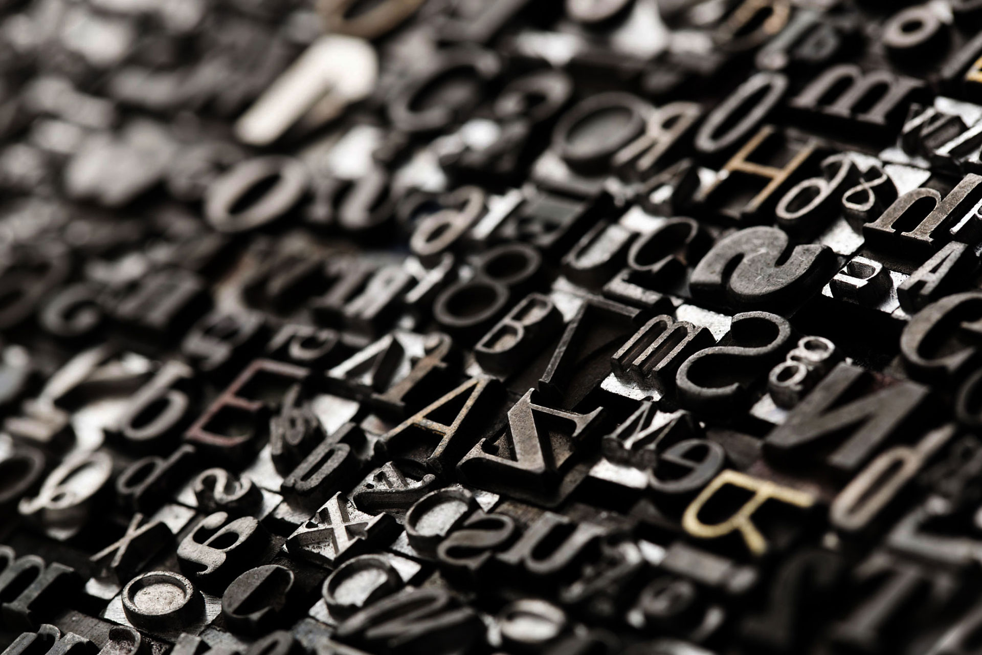
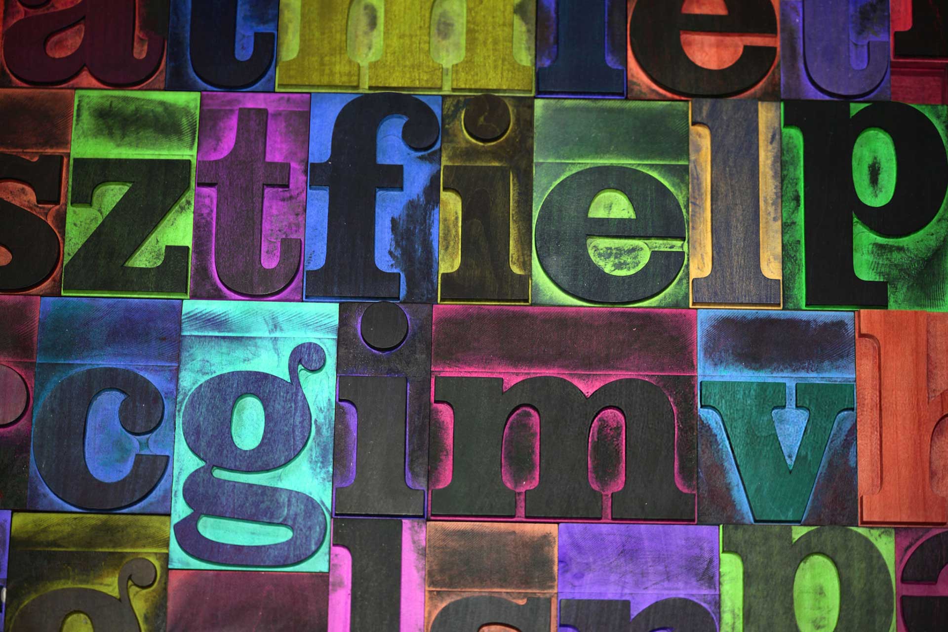
At the basic level, typography is the art that involves arranging a typeface in various combinations of font, size, and spacing. In this way, a wide range of designs including website design, brochure designs, print design, books, and computer graphics, etc. depends on the skillful use of typography for making an impact.
Graphic designers use typography to adjust the text within the design. This helps in creating content with a purpose. The planned use of typefaces allows the designers to make a design look aesthetic and pleasing.
The designers have been using typefaces strategically to make a text readable and also to make an impression on viewers. Because of such designs with unique typography ideas, a brand can communicate with its audience in an effective way.
Typography allows designers to create visuals for brands. Graphic designers consider some crucial things when using typography. They make judicious decisions regarding choice of font, size, body text, white space, placement, and many other aspects of using a typeface.
Different Elements Of Typography
Typography is no more a simple way to arrange typefaces as it used to be once. With new technologies and designing needs emerging, designers and printers use many terms that hint at their requirements. Here are few of the typography terms commonly used in the typography world:
i. Typefaces And Fonts
Often, fonts and typefaces are the terms mistakenly used interchangeably by many. Technically, a typeface comprises many characters of varying weight and sizes. Typeface refers to creating the text style such as Arial and Helvetica. A typeface is a family of the fonts related to the typeface.
A font refers to weights, widths, and styles of a typeface and is a graphic representation of text characters. Fonts are about the width and height of a typeface and refer to its style. All typefaces have different font sizes. So, graphic designers know every individual character as x-height.
When the designers want to pair fonts together, they generally pick a typeface that has a similar x-height. The width is about the area of the body of the letter and the space that follows. To measure the typeface, the designers use the point system. So, one point is equal to 1/72 of an inch, and 12 points equals to one pica.
ii. Leading
It’s the vertical space we see between each line of words.
iii. Leading Value
The distance between the two lines of text is the leading value. Mostly it is more than the font size.
iv. Tracking
Known also as letter spacing, tracking is the space we see between text characters.
v. Kerning
Kerning is the space left between characters and letters.
vi. Line Length
The line length is the standard length of the text.
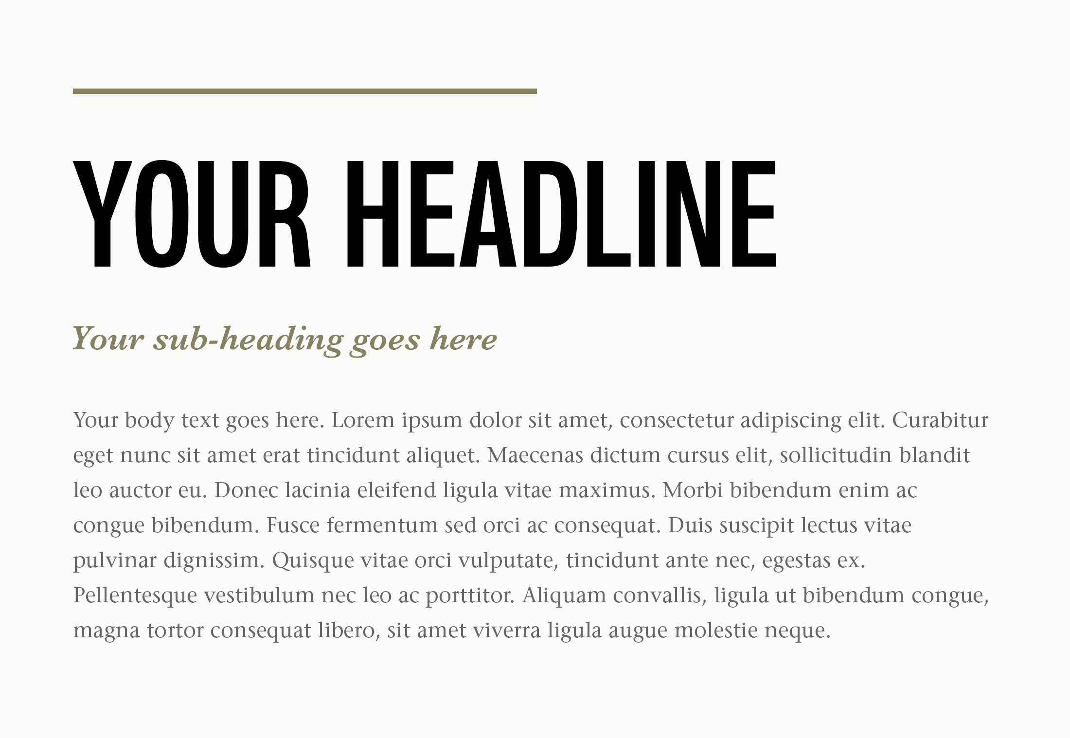
vii. Hierarchy
Hierarchy is about guiding the reader to notice the headers, subheadings, and body types as per the importance of the text.
viii. Size
Size determines the hierarchy value, and it is done through the use of spacing, dimensions, and colour.
ix. Colour
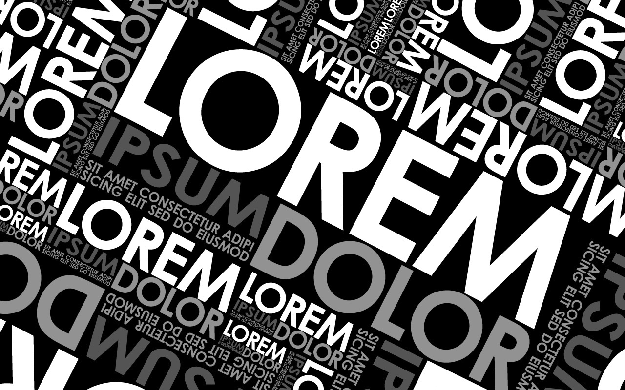
Text colour helps a text stand out. It conveys the tone of a brand message. A designer balances the three components of colours – value, hue, and saturation.
x. Alignment
Alignment is a crucial typography element to unify text to give it equal size, space, and to ensure the right distance between each element.
xi. Contrast
Contrast is another key typography element to help designers highlight an idea or message. It makes text meaningful, attention-grabbing, and interesting.
Basic Rules Of Typography For Graphic Designers
Graphic designers use typography with a purpose. They have a certain brand message to convey to a target audience, which compels the designers to use typefaces creatively.
Some graphic designs are solely based on text. To make such visuals look appealing and purposeful, the professional designers follow some time-proven rules of typography. Here is what they consider:
i. Consider Text
An experienced graphic designer will first read the entire text given by the client carefully. When it comes to incorporating the text in website design, it becomes all the more important. Many designers make the mistake of simply copying and pasting the text from a file.
But the wrong choice of typeface and font will not help in leaving a desirable impact on viewers or customers. So, to grab customers’ or visitors’ attention, first read the text completely so that you get a unique idea of how it should be incorporated and integrated into a design such as a website. So, go through the entire text minutely before you set out to pick the right typographic element
ii. Show Hierarchy
Hierarchy is about guiding the viewer’s eye to the most important element on the design, such as website design. The designer uses the typography to decide where a visitor should read first. To create hierarchy, the designer uses font size and typeface to catch the eye and drive the attention to the most important information.
Generally, the designers create an impactful hierarchy in a design by adding three different levels of typography. The level-one typography is generally the most significant content. This is the one that viewers see the first distinctively visible typographic element in your design.
The level-two typography element is used to create the text into a group or section of information to help viewers navigate the details easily. But this level of typeface should stand out.
The level-three is usually the meat of design and it is a text-heavy layout. Here the viewer gets into the message of your design. It could be your whole article or a brief description. The primary aim of typography at this level is to make the reading easy since the font size is usually small.
iii. Pick The Right Colour Of Typefaces
The designer chooses a perfect colour of typography so that it becomes easily readable. With the use of colour, catching the visitor’s eye becomes a lot easier on a website or other design. A wrong choice of typography colour may result in the viewer losing the attention due to various design elements in the background.
Therefore, the designers and typography artists pick a colour that is in contrast to the background colours. For instance, choose a black text if the background is in white or light colour to make the text readable.
Why Is Typography So Important To Graphic Designers?
An overwhelming majority of sites and designs are occupied by content, which requires careful use of typography. Displaying content is, after all, an art that typography can handle very well. Remember that text-based content is a key to bring visitors and keeps them engage with a site.
So, the viewers should be able to perceive the content easily. Therefore, graphic designers understand the significance of typography.
Here Are Some Key Reasons Why Typography Is Crucial To Graphic Designers
01. Grab The Viewer’s Attention
The attention span of people is fast decreasing, and it is now a few seconds only. Brands have to grab the attention of their target customers in that friction of time. Graphic designers, therefore, use the power of typography to catch the eye immediately.
Since typefaces come in a wide range of shapes, sizes, and styles, these elements become crucial to creating unique designs. The designers today use even kinetic typography as a way to draw viewers’ attention to
02. Make Text Reader-Friendly
Careful use of typography ensures that visitors can read the text on a web page easily. A wrong choice of fonts will make the presentation complex and confusing for the viewers.
For instance, small and craped fonts create tension in the eyes. So, even when the design project is fun and complex, the audience should be able to scan the text.
The readability of the content also depends a lot on how the designer does alignment and arranging of the text. Conventionally, the designers have been aligning the font in four ways: right, left, centered, and justified.
But now they can align text in whichever way they want due to the power of CSS and Photoshop images. But the purpose of the text alignment also is to direct the reader to the most crucial information.
03. Establish Hierarchy
An experienced and skilful graphic designer makes good use of different font sizes and font types to draw visitor’s attention to the most important information first. The viewer can locate such information jut by having a quick look at it. To achieve this, the designer uses a variety of font sizes for heading, subheadings, and the text body.
04. Builds Recognition
Brand recognization is crucial for businesses to deal with competition. In graphic design, the fonts are the visuals that target customers or visitors keep in memory for a long time. It is these visuals that help a business build recognition amongst its customers.
Many logos are typography based. They are all brands that people recognize quickly. So, your typography design ideas should aim at building your brand recognition.
05. Give Value And Tone To Your Brand
Typography is also helpful in setting the values and tones of a brand. Each typeface has the power to represent businesses in different ways in terms of what they do and what for they stand. This is precisely the reason for there being many kinds of typefaces as they represent different moods and effects through a design.
The audience understands a design by grasping its message. So, the designers incorporate the fonts that set the tone to present and convey a message.
Take, for instance, sans-serif typefaces. These are typically preferred to give a design or a text page a clean, simple, and easy to read look on a large scale. So, these are modern looking typefaces.
On the other hand, serifs are generally considered conventional and old-fashioned. But these are also easier-to-read typefaces and so graphic designers prefer these for long-form content such as books and blogs.
06. Create Harmony
Graphic designers use typography also to ascertain harmony in a design or a web page. A harmonic design has an artistic effect on viewers. The designers use the same font for similar content so that people can recognize it immediately.
This also helps in providing continuity to the design. So, when a graphic designer aligns fonts with the correct proportion, it gives a clean and uncluttered look to a presentation.
07. Give Personality To A Design
One of the characteristics of typography design is that it gives personality to a design. Your design or web pages look friendly or high-end, playful, serious, welcoming, etc. because of the strategic use of typefaces. You can use certain typefaces to reflect your brand’s traits.
Remember that various typefaces and fonts carry different characters and meaning. Therefore, a designer uses this to give personality to a design. So, finding the right typefaces with a personality balance is difficult, but it is crucial to create unique designs.
08. Make A Visual Impact
Typography is also an important element to build an impression on viewers or users. Its glaring example is that these days the designers use larger fonts for a bold visual impact. They convey the message to the viewers about the purpose of the content. You can notice some stunning pieces of artwork based on larger fonts.
Such designers seem to follow a new philosophy of giving a message through bold typeface. For this reason, websites have larger headers that look like the cover of a book.
These benefits of typography should compel you to have a relook at your brand’s visuals. Your brand must be having a website, brochure, business card, logo, and a whole gamut of marketing materials. Most of these identities use typefaces in different capacities. If you think that they need to be redesigned using the power of typography, then let an experienced graphic designer handle the job.
Wrapping Up
Typography is a crucial element that uplifts a design and gives it a personality. For designers, typography is a way to use text as a visual to convey a brand message. This design element is important for graphic designers not only to build personality, convey a message but also to grab the viewer’s attention, build a hierarchy, brand recognition, harmony and establish value and tone of a brand.
*Edited from original article