


Less is more — the principle of minimalism can be found in all areas, including design, architecture, literature, and even in everyday life. Is the principle of minimalism overused or even more relevant than ever? This article examines minimalist web design and pleads for the following basic principle: Embrace the empty space instead of graphic overload
Minimalism is synonymous with simplicity. Not quite. As the name suggests, minimalism is definitely not about opulent design. But the assumption that minimalism is design-less and plain is also wrong. Minimalism is simple yet highly complex. Of course, there are countless definitions of minimalism. Here is one of the most apt ones:
Minimalism. A school of abstract painting and sculpture that emphasises extreme simplification of form, as by the use of basic shapes and monochromatic palettes of primary colours, objectivity, and anonymity of style. Also called ABC art, minimal art, reductivism, rejective art.
How did minimalism evolve?
Art and architecture before the 1920s was characterised by the playful patterns and lavish ornamentation of Art Nouveau or Art Deco. In the Arts and Crafts movement, gilding and expensive materials made for good design. This was followed by the Bauhaus era, a counter-movement originating in Germany that aimed to produce simple design with affordable means and resources. Their motto “form follows function” was influenced by the simple designs of the Dutch movement “De Stijl”. The style was often not understood by the broader public and was described as sparse or bare.

A few decades later, artists rediscovered this direction and Minimalism was established. Minimalist artists asked themselves the question: How much can you strip off an object — painting, sculpture, building, furniture — without losing its essential purpose and identity?
“Strip everything down to its essential quality and achieve simplicity”
Minimalism influenced all arts and technologies in the late 20th century. A hero of Minimalism was the German architect Ludwig Mies van der Rohe (1886–1969). He is considered a key figure of minimalism and one of the fathers of modern architecture with its clear forms. His primary principles were the reduction of architectural structures to a minimum and the use of a lot of open space. The basic principle of his work was “less is more”.
From Architecture to Minimalism in Product Design
Steve Jobs is often referred to as a design pioneer, yet he himself did not want to use the word design. His principles were also initially concerned with one thing: functionality.
“Design is a really loaded word. I don’t know what it means. So we don’t talk a lot about design around here, we just talk about how things work. Most people think it’s about how they look, but it’s about how they work”
Steve Jobs
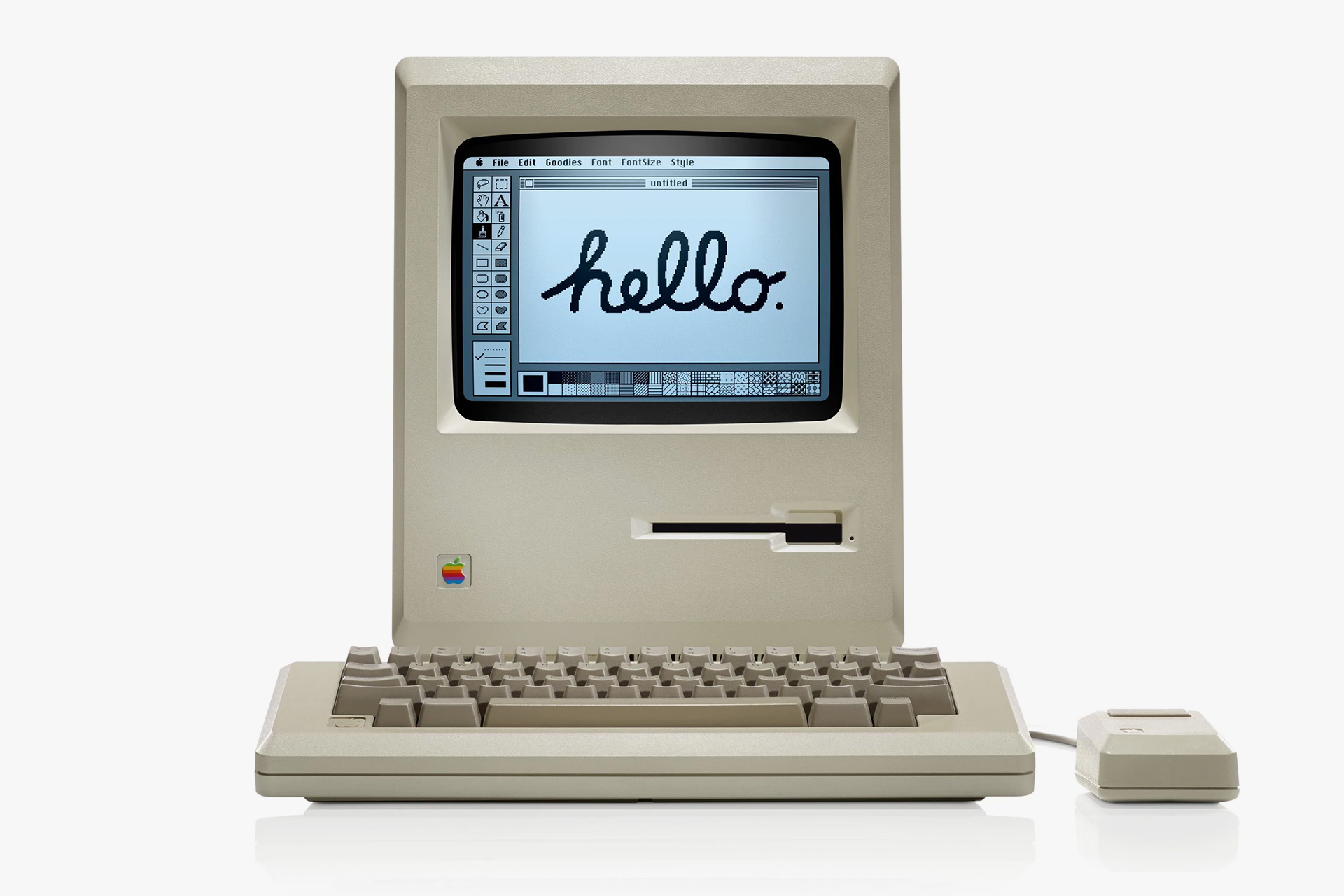
Apple reduces its devices to the essentials. Obsolete buttons are not to be found here.
One could say that the principle of user experience is based on Jobs’ principles. Applied to web design this means pushing the limits in trying to find the absolute minimum of the content we need in order to convey a clear and concise message. This means leaving out everything that could possibly distract from the actual message.
Minimalism in web design results from the subtle use of fine lines, geometric shapes and short, concise texts with well-selected typography. Hidden content, accessible by clicking on abstract symbols, as well as subtle nuances and barely noticeable graphics further strengthen the minimalist character.
Key features of minimalist web design
1. Principle #1 Do not fear empty space! (Negative space)
When everything inessential is stripped away, empty space is left around a graphic object. It is this very space that makes minimalist design what it is.
When a website has an adequate amount of white space, you will get a calming, relaxing feeling. It brings peace to the room, in other words.
In minimalist design, the main purpose of the negative space is to draw the viewer’s attention to a specific point and guide him or her through the site. Some people consider the negative space just as important for the design as the content; the images, the graphic elements and the text. Nevertheless, this same freedom forces us as web designers to be more precise with the objects we choose.
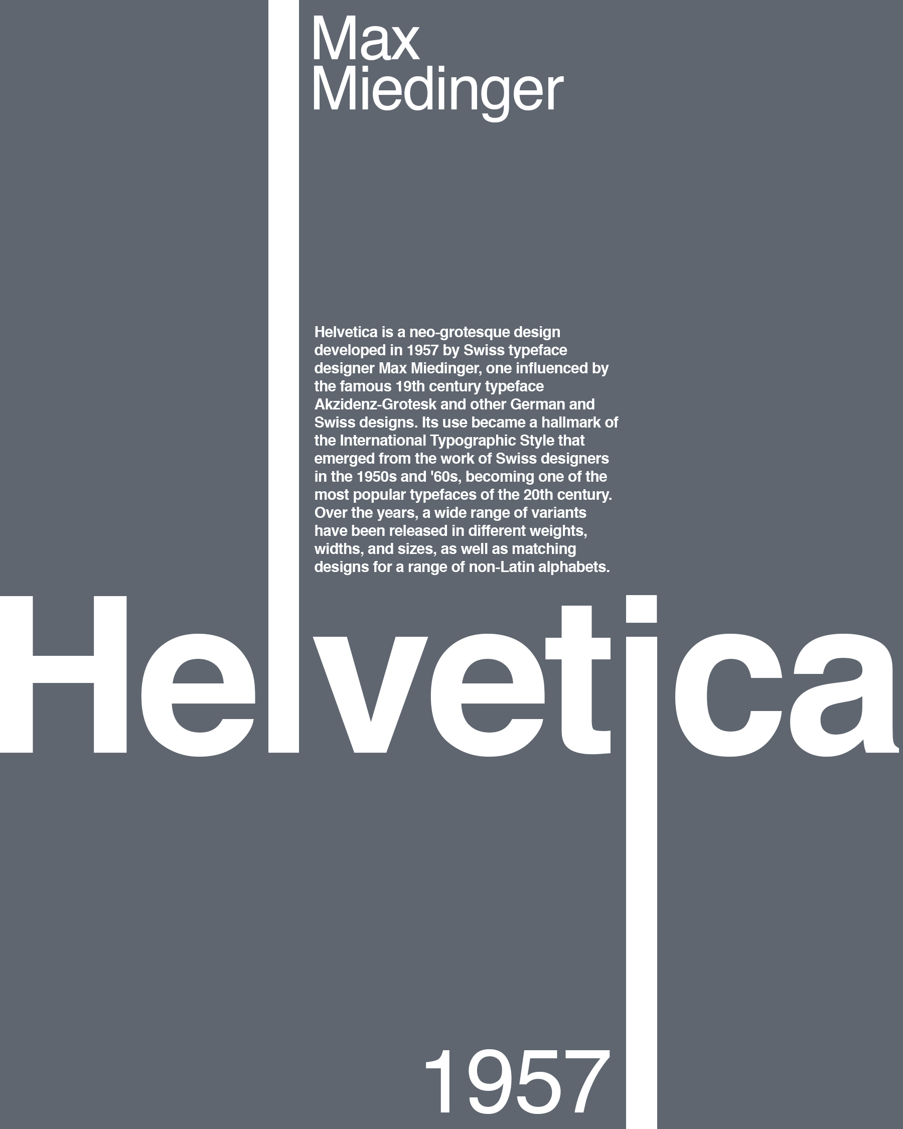
2. Principle #2 Typography is like fine art
Minimalism thrives on well-selected typography. Since text is one of the few elements used to dominate negative space, it becomes much more valuable as a graphic element. In minimalist web design, in general, less text should be used. In addition, it is more likely to work with few fonts but with different font styles.
Typography is a separate area, which will be improved by a lot of experience. However, typography is indispensable for websites.
“Typography is the craft of arranging type with the goal to make language visible. We arrange type multiple times throughout the day; whether we are writing essays, summarizing meeting minutes or creating slides for a presentation. Unfortunately, we usually end up thinking more about what we write than how we write it. And, most importantly, how others will read it.”
The typeface Helvetica, the most used typeface of the 20th century, for example, is a relic from 1960, the beginning of minimalism.
3. Principle #3 Choose images wisely
To the inexperienced eye, a page can already be considered professional by selecting good images. However, images should be used rather sparsely for minimalist web design. If images are used, then each one should be carefully selected. As for the style of the images themselves, many believe that flat images or images without three-dimensional shading and lighting are a standard for minimalist design. This may be true but is not always the case.
4. Principle #4 Choose colours correctly
A common assumption is that minimalist design only works through black and white or in grayscale. But this is not the case. Although monochrome design is often used, this is not a requirement for minimalist design. Similarly, a page is not automatically minimalist just because the images appear in black and white. Traditionally, minimalist designs are based on a moderate colour spectrum, typically consisting of two or three colours.
Another tactic is the use of monochrome shades of grey and another colour tone that is only used specifically for highlights and as a link or hint colour. This can also be a signalling colour.
Another elegant solution is colour palettes in pastel shades. These have relatively high luminosity and low saturation.
Web designers should define their colour palette at the beginning of the creative process and save it as a colour palette this way no deviations are risked and the entire website follows a uniform colour scheme.
5. Principle #5 Consistency through Structure
Minimalist websites are often highly artistic and generally, there are no boundaries to creativity. However, it is important to ensure that the website does not neglect its main task: information. The users should find their way around easily and follow a logical structure without concentrating too much. The user experience should not be hindered by the design. Maintaining a simple and very clear visual hierarchy is another essential feature of minimalist design. Here, both the high amount of negative space and the few elements within it can be an advantage. It has been proven that users navigate mainly in F-shape (from left to right, top to bottom).
In general, many websites work with a grid for laying out the page design. This can also be deliberately broken or exceeded to create intentional asymmetry.
Minimalist design is surprisingly complex. But when used well, it provides the perfect combination of aesthetics, usability and site speed thanks to the sparse use of images. This leads to intuitive and unrestricted user experience.
However, before starting the design phase, the following questions should be clarified: What is the aim of the planned website? Should it sell anything? If so, what? Should it inform? If so, what about? What kind of conversion should be achieved? Only once these insights have been found the creative process should begin, with constant reference to the findings.
Today’s web designers often have to be artists and designers, but at the same time, they have to become technology specialists. But we should always remember the principles of the design pioneers:
“Less is more” — Ludwig Mies van der Rohe (1947)
“Form follows function” — Louis H. Sullivan (1896)
In conclusion, minimalist design can be highly aesthetic; however, if the user experience fails, users will quickly exit the pretty page.
*Edited from original article